
|
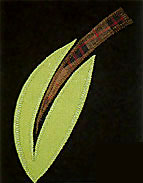
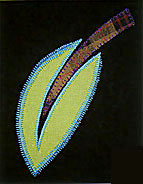
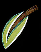
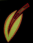
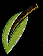
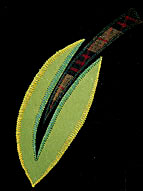
Featured Writing: Spring 2004 Exploring the Satin Stitch Jane's recently introduced line of quilt patterns makes liberal use of satin stitch to achieve many of her signature effects. Although Jane explains the basics of satin stitch in the pattern instructions, we thought we would shed a bit more light on the subject by excerpting a more intensive discussion on the topic from her book "The Quilted Garden": There are actually very few stitches on my fancy sewing machine that are appropriate for my hard-edged graphic style; however, the satin stitch is one I have come to rely on for its simplicity and versatility. I use the satin stitch to cover the raw edges of my raw-edged appliqued shapes and to attach two overlapping pattern pieces. This means that the satin stitch line often follows or outlines each individual shape and pattern piece. Satin stitch is just a fancy name for the zigzag stitch. By adjusting the length and width of the stitch, I can take advantage of many design effects. I've discovered that this simple stitch can enhance the quilt's surface by either defining or distorting the shapes and lines of the design. The satin stitch can electrify, or it can subtly blend shapes and colors. The satin stitch can also act as a drawing line, which becomes a new graphic element all together. I especially enjoy using this stitch in a painterly way to suggest the presence of a light source, such as the sun, and as a sculpting tool to give the illusion of depth and texture to the surface.
To reinforce and emphasize the line between the ieaf and the background, I use matching thread and a slightly open satin stitch so the fabric of the leaf is still visible. The needle follows the edge of the leaf as its guide. Blurring or Distorting Shapes As a Drawing Line Electrifying Shapes Painting and Sculpting Shapes On each of the leaf samples, I used an open-toed embroidery foot on my sewing machine, which allows me to see the stitches as they are [being made and to guide the needle with more precision. The threads are basic cotton/ poly or a 30 weight rayon, both with cotton/ poly thread in the bobbin. I also adjusted the width of the satin stitch to accentuate the points and curves of the leaf. The stitch is narrow at the base and gradually widens as the leaf widens. At the mid-point, the stitch begins to taper toward the tip of the leaf. It is also important that you allow yourself time to complete the embroidery stage to the best advantage of the work. At times, machine embroidery and quilting can be exhausting and monotonous due to the intense concentration required and the tedious repetition of tasks. However, there is a difference between what is monotonous while working and what is monotonous to look at in the finished quilt. Each stitch should strengthen the visual impact of the quilt. Some stitches will be obvious and easy to see, but some important stitching can be so subtle and subliminal, that the viewer only sees the impact or effect, but is unaware of its existence. Quilters must learn to weigh the desired visual effect of their work and the time they devote to it. Devoting the necessary time to your work will make it sing. Sometimes less is more when it comes to applying embroidery; sometimes more is better. The trick is letting each successive layer of attention contribute to strengthening the voice of the final work. To relieve the strain and tedium of the embroidery and quilting phase, I try to vary my tasks from time to time and to allow myself frequent breaks. It's helpful to find small diversions so you can maintain your enthusiasm for the job. Wash a few dishes, see what's new (or old) in the refrigerator, or sweep the floor. These tasks will definitely make returning to tedious embroidery look good by comparison. Listening to books-on-tape is also a wonderful way to keep your thinking mind occupied while you work on automated tasks. When the quilt is finished, tedious tasks, such as embroidery and quilting, should not look tedious and strained. They should look effortless and painlessly integrated into the whole design. Your diligent attention should manifest itself into delicious details that accentuate and energize your quilt. OTHER EMBROIDERY OPTIONS Each quilter has a different style of working and individual ideas to express. Just as quilters are different, so are sewing machines. Each brand and model offers a unique selection of features and stitches. Quilters must discover for themselves which machine, features, and stitches are appropriate for their work. Most of us are limited to the machine we already have and should, therefore, learn to explore its abilities to our fullest advantage. I have a pretty fancy sewing machine with many stitches and features, but even so, there are very few stitches that are appropriate for my visual style. Occasionally, I'm thrilled to discover a new stitch that can speak my language. Each of these stitches becomes part of my visual vocabulary. To test the stitches and effects of your own machine, I suggest that you make a sampler such as the one shown on the next page. Apply simple shapes, such as leaves or doughnuts, with fusible web to a solid-colored background. I also recommend reinforcing your background fabric with a layer of interfacing or tear-away stabilizer to keep your sampler from buckling. From "The Quilted Garden" by Jane A Sassaman, published by C&T Publishers. Click here to purchase The Quilted Garden by Jane A Sassaman.
|
||||||||||||||||||||||||
Featured Writing: Fall 2003 Checking the Quality: What's Worth $10/yard & What Isn't If you've ever wondered about the price differential in the fabrics offered by national chains versus those found at your quilt shop, read on. This is an excerpt from Weeks Ringle and Bill Kerr's first book entitled Color Harmony for Quilts. You probably know Weeks and Bill from their project FunQuilts and their new line of Free Spirit fabric called PRISM. You can check out their world at funquilts.com. When buying fabric, cost cannot be overlooked. National retailers boast large selections of $3/yd (1m) fabrics. Fabrics at quilt shops generally average $6-10/yd (1m). Is this price difference a reflection of volume discounting or of quality? When trying to gauge the quality of a fabric, it's useful to understand a bit about the economics of the manufacturing process. Manufacturers have lines of fabrics that are aimed at certain segments of the quilting market. Some are marketed to the bargain shopper, others are marketed to quilters seeking heirloom-quality fabrics.
First, feel the fabric. Compare it to other fabrics in the store at different price points. A stiffer fabric usually indicates a poor quality of printing or that the fabric has been over dyed. Overdyeing will cause problems with wear and washing as uneven fading may occur as early as the first wash. A tightly woven cotton with more threads per inch will wear better than a more loosely woven cotton. Hold an expensive fabric from a quilt shop up to the light next to a bargain fabric from a national chain. Can you see the difference in the density of the weave? When you find high-quality fabrics, note their manufacturers and keep track of those whose fabrics wear well. Most manufacturers' fabrics are even in quality across their product lines. From "Color Harmony for Quilts, A Quiltmaker's Guide to Exploring Color" by Weeks Ringle and Bill Kerr, published by Rockport Publishers. Click here to purchase Color Harmony for Quilts. |


![]()